Polo.ng
Make a statement

LOGO RATIONALE
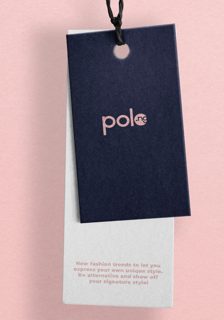
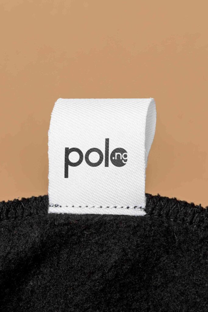
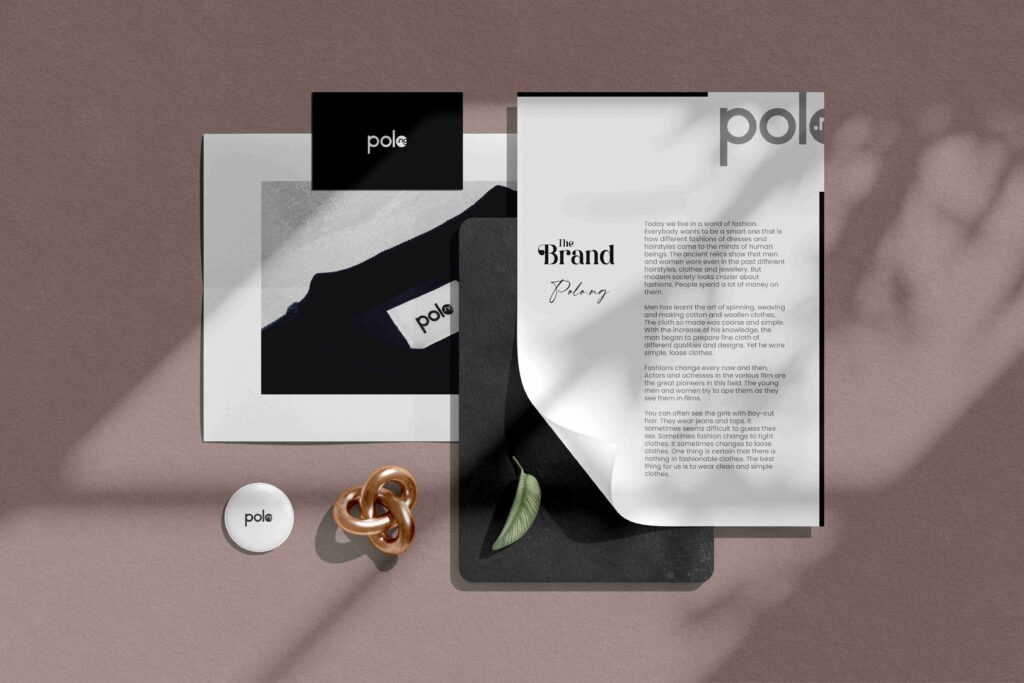
The logo presented for Polo.ng is a minimalist and modern design that reflects the brand’s core values and target audience. Here’s an analysis of the elements and their significance:
Simplicity and Clarity:
The logo’s clean, streamlined design with a focus on simplicity ensures it is easy to recognize and remember. This reflects the brand’s approach to fashion, emphasizing straightforward, yet stylish, apparel.
Typography:
The choice of font (if applicable) is likely to be clean and contemporary, suggesting that the company values a modern aesthetic. This can appeal to a wide audience, particularly those who appreciate minimalism in design.


Color Palette:
The logo’s color choice (white, based on the provided image) reinforces simplicity and versatility. White is often associated with purity, sophistication, and modernity, making it a fitting choice for a clothing brand aiming to convey these qualities.
Versatility:
The logo’s simplicity ensures it can be easily adapted across various mediums and scales, from T-shirt tags to large billboards. This adaptability is crucial for a brand in the fashion industry where the logo will appear in different contexts and sizes.
Target Audience Appeal:
By opting for a minimalist and modern design, the logo likely appeals to a fashion-forward demographic that values understated elegance in their clothing choices. The logo’s clean lines and lack of clutter suggest a brand that offers high-quality, well-designed products.
Brand Identity:
The logo’s design effectively communicates the brand’s identity as a producer of stylish, yet accessible, T-shirts. Its simplicity suggests that the brand’s products are both trendy and practical, fitting seamlessly into the lifestyle of their customers.


